
01
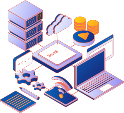
SaaS Development
Multi-tenant architecture, subscription billing, SSO, compliance — engineered in from day one, never bolted on later.
From-scratch SaaS, custom web platforms, mobile apps, and AI agents — built by a team with a track record. Published scope, a committed delivery date, and 13,000+ users on products we've shipped.
Custom SaaS, shipped for businesses across 100+ countries.
Trusted by Leading Global Company


SaaS products, custom web platforms, mobile apps, AI agents, and validation-ready MVPs. From-scratch builds with published scope and a committed delivery date.
Multi-tenant architecture, subscription billing, SSO, compliance — engineered in from day one, never bolted on later.
Internal tools, B2B portals, enterprise dashboards, and CRMs — built from the schema up, never retrofitted from a template.
iOS and Android shipped to the stores. Flutter for cross-platform speed, native where the build demands it. Push, offline, biometrics, payments — all production-grade.
RAG pipelines, agentic workflows, and voice agents on Claude and OpenAI — with eval harnesses, observability, and a real ROI model engineered in from day one.
Working product in 6–8 weeks. Real users, validated metrics, and a clean codebase that scales into the full SaaS — not throwaway prototype code.

Reasons to pick Xgenious over offshore agencies.
Every engagement is a from-scratch build on a modern stack — React, Next.js, Node, Laravel, Flutter, AWS. No surprise "starter" code that breaks at scale.
“The code quality was outstanding. Clean architecture, well-documented, and built to scale. Not a template in sight.”
— Founder, eCommerce SaaS
13,000+ active users across Nazmart, Xilancer, Prohandy, Fundorex, Nexelit, Helpnest, Grenmart. We know what running a real product takes — because we run several.
“Xgenious delivered in 14 weeks what two other agencies said would take 6 months. They clearly know production software.”
— CTO, Marketplace Platform
GDPR, HIPAA, SOC 2-ready architectures by default. DPA on every engagement. UK Ltd, US Delaware C-Corp, and UAE DMCC entities so your procurement team can sign locally.
“DPA signed in 24 hours. Threat model reviewed on the architecture call. That level of professionalism is rare at this price point.”
— VP Engineering, B2B SaaS
Across eCommerce, marketplaces, on-demand services, fundraising, and AI — operated by the same engineering team available to build yours.
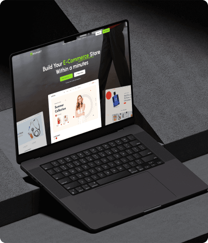
Multi-Tenancy eCommerce Platform (SAAS)
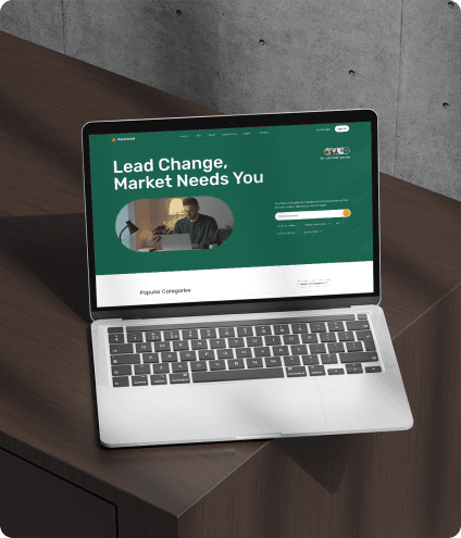
Freelancer Marketplace Platform
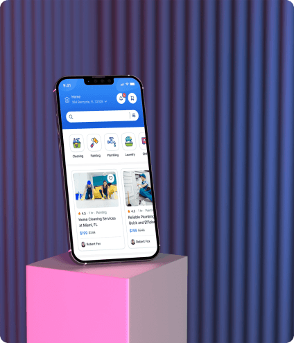
On Demand Home Service Platform
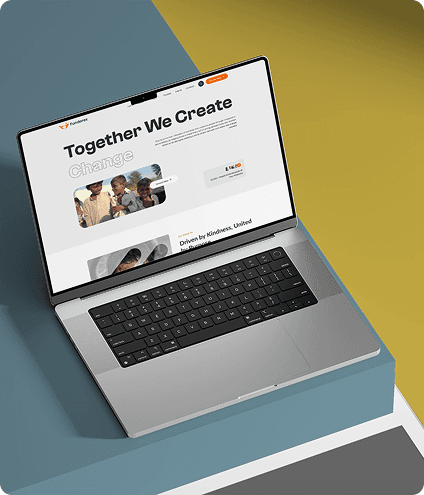
Crowdfunding and Donation Platform
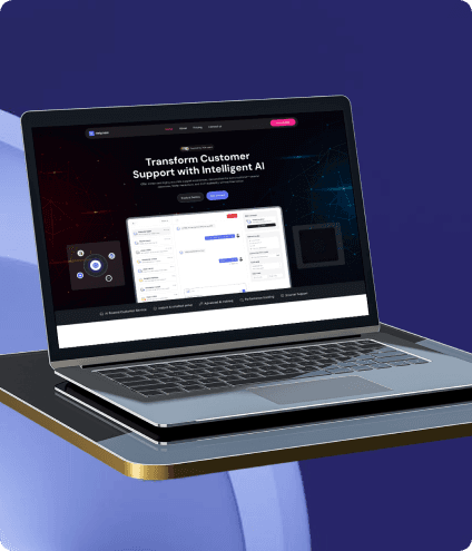
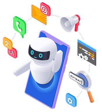
AI Chatbot & Customer Support SaaS Platform
Multipurpose Website CMS & Business CMS
Multi-Tenancy eCommerce Platform (SAAS)
Freelancer Marketplace Platform
On Demand Home Service Platform
Crowdfunding and Donation Platform
AI Chatbot & Customer Support SaaS Platform
Multipurpose Website CMS & Business CMS
Multi-Tenancy eCommerce Platform (SAAS)
Freelancer Marketplace Platform
On Demand Home Service Platform
Crowdfunding and Donation Platform
AI Chatbot & Customer Support SaaS Platform
Multipurpose Website CMS & Business CMS
Multi-Tenancy eCommerce Platform (SAAS)
Freelancer Marketplace Platform
On Demand Home Service Platform
Crowdfunding and Donation Platform
AI Chatbot & Customer Support SaaS Platform
Multipurpose Website CMS & Business CMS
No logo-salad. Each layer picked for a reason we're happy to defend.

Same engineering team across all four stages. No handoffs to junior pods. No mid-sprint surprises. A delivery date you can plan around.
Autonomous agents, workflow automation, decision systems, or LLM integrations — built from scratch for your data, your tools, your team.
[email protected] · just now
“Xgenious is not just a company; they are a team full of honesty, support, and professionalism. I have worked with many developers before, but the way Xgenious s…”
Sourav Dutta
“A product is only as good as the team that supports it. You guys are the best. Stable product and the team is very polite, efficient and always ready to help. I…”
Rohit Ahuja
The questions every buyer actually asks. If yours isn't here, ask it on the call — we will answer it honestly.
MVP: 12–16 weeks. Full production SaaS with mobile, AI, and compliance layers: 20–24 weeks. You receive a committed launch date in the proposal — not a rolling estimate that shifts every sprint.